Search My Blog...

Tuesday, 23 February 2010

'FRONTIN' Nicky Clarke, Birmingham

Bit of a random one I know but I'm not rating their haircuts! I was just interested in their shop windows and how they have used frosted glass/opaque style masking in the front of the store, restricting your view in. To me, it could add to the exclusivity or luxury nature of a store/brand if you are restricting the view into the store interior. This could be a useful VM technique to be exploited by a high end retailer to add to the luxury ambience and aesthetics. I noticed that the Adidas store in the city centre also used this technique and it really makes the brand stand out from the neighbouring stores that are using the standard, clear glass frontages...

Also the masking technique could work well as a visual guide to the consumer, forcing them to focus their eye on a particular gap to peer through, within the shop window. This gap could then feature a product which is exclusive to that particular store/ a new release or a seasonal must-have product, in a similar style to how Nicky Clarke have used the opaque vs. clear glass to focus the onlookers eye to the hairdressing (their product), which is actually happening within the shop, at eye level, almost like a picture frame to see yourself in... Eye level is buy level

Clear, standard glass is boring, it's all about the tints and masks. You should start frontin'

Sunday, 21 February 2010

Harvey Nichols, Birmingham

http://www.youtube.com/watch?v=PGRxjcsUOro

"When I shop at Harvey Nicks, everyone thinks I'm a star..."

The Birmingham Harvey Nicks is very nice. Set in the stylish and artistic Mailbox, it is clearly the dominant store, the name can be seen across the tall glass windows at the front of the store from well outside the Mailbox. I've only ever been to the London flagship store which I feel does have a better, more eclectic collection, naturally, but the Birmingham store measured far higher in terms of customer service. There was an unexpected welcoming feeling when I entered the store (even had the door opened for me by some meathead in a dapper suit!) and the staff genuinely looked happy to be there, not with "the pretty bird behind the till... flipping through Marie Claire", as picked up by the Mitchell Brothers.

The 'new normal' of retail stores looking to try and sell more of an experience and identity was also evident with the use of catwalk videos being played on wall-mounted monitors. This makes the whole environment feel more personal by increasing the amount of interaction/communication from the store to consumer and is more sophisticated than a standard poster. The Birmingham store was also advertising their exclusive Fashion Show on posters and flyers in-store. The show is on Tuesday 2nd March 2010, from 6.30pm and will begin with a champagne reception followed by a runway featuring the key looks from menswear and womenswear Spring/Summer 2010 collections... Nice little bit of PR and marketing for their SS10 collections. For more info, click here

The choice to put Harvey Nicks in the Mailbox away from the main department store competitor, Selfridges, gives the city a bit more stretch in terms of offering an attraction further outside of the city centre. Also this speaks for the 2 stores with Selfridges and the more youthful, commercial Bullring within the heart of the city centre and Harvey Nichols offering more of a sophisticated and artistic setting within the Mailbox. The Visual Merchandise was looking interesting... it was as if the Chapman Brothers had directed the scenes of deconstruction and mannequin massacre which also rang bells of Victor and Rolf's highly conceptual SS10 womenswear collection. The mannequins were styled to look dismantled and deconstructed within a similar backdrop of chaos with the tables and chairs bent and manipulated. It looked like a bomb had gone off in a 50's style kitchen. The whole construction/deconstruction theme looked emminent in B'ham VM with River Island and the DKNY stores using similar ideas with broken boxes and packages. (Watch out for the blog entry on this stuff later)


The Mailbox, Birmingham

No one in Brum got swagger like this...

As a retail environment I MUCH prefer this place in comparison to the Bullring. The space is much more stylish and upmarket. The surroundings are less in-your-face retail in comparison to the hustle and bustle in and around the Bullring, in the heart of the city.

*statistically - you are 99% less likely to get rammed by a buggy or trod on accidently by somoeone you swear you recognise off Jeremy Kyle.
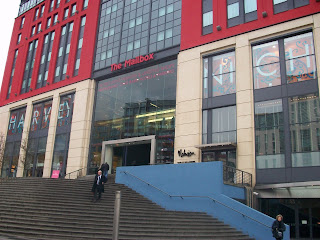
The type of consumer is very different and that's obviously a result of the type of stores the Mailbox offers. The Mailbox houses a couple of nice, little art galleries, a Nicky Clarke salon, Harvey Nics, All Saints and the Handmade Burger Co. to name but a few. This area feels much more 'business' and 'industrial' which is probably due to the upmarket office developments and luxury, city apartments (the Cube development is near to completion and looks sick!) next door to the Mailbox. The whole feel to the Mailbox is much more chillin', you can just take your time and browse or window shop rather than feel like you constantly have to struggle through a traffic jam of people. If you're ever around that area of Birmingham, I strongly recommend taking a walk through the Mailbox (and treat yourself at the Handmade Burger Co. you won't look back!)

Saturday, 20 February 2010

SHOCK & AWE - Diesel, Birmingham

BE STUPID

Ever felt like taking a break from the constant drag of your normal dreary life and doing something stupid? Well, Diesel has gone a step further this season committing a whole campaign, urging us to "Be Stupid". In true Diesel fashion, the brand hasn't held back and has gone the whole hog adopting an aggressive marketing strategy, screaming the brand attitude and current philosophy. The campaign is backed up by a series of posters (a selection of which are shown here) shot by photographers Kristin Vicari, Melodie McDaniel and Chris Buck, each showing examples of people 'acting stupid'. The imagery and slogans are witty, edgy and smart which ties in perfectly with the brands identity. The visuals and feel to the campaign hits the target market nail bang on the head. In addition to this, Diesel are trying to recruit 'stupid people' (though judging by the call for entries, which asks "are you doing something particularly stupid right now...like starting a band, building a tree house or creating an art installation", are in fact simply creative people) to be part of a forthcoming music video that will feature the new Diesel collection. The timing to this campaign clearly has a large input on the effect of this "Be Stupid" philosophy. At a time where we are constantly being filled with seriously depressing news (think: recession, Iraq, Haiti earthquake, John Terry acting a prat!) Diesel have clearly played this to their advantage and slapped and nipple crippled the current boring, grey notion of society.

The Birmingham store had the windows and interior VM boldly shouting the "Stupid" theme. Diesel staff all wore the "Be Stupid for successful living" tee's (which come as a free supplement in the February edition of Dazed & Confused). The t-shirts bring out the bold, unforgiving attitude to the campaign as inside the collar reads:

"One size fits all. If it's too big for you. Eat more. If it is too small for you. Diet.
If it fits you. Congratulations."
The feel to this campaign is rebellious, youthful and creative, very much the brand identity of Diesel's adolescent son - FiftyFive DSL (55DSL) who I am also a fan of. This spring, the two brands are sharing a very similar attitude... like father like son! 55DSL has always been a favourite of mine but I feel the brand could be/should be much bigger than it actually is within the UK. With more direct marketing to the consumer and some effective PR (sponsoring a few urban music gigs, skateboard comps, graffiti workshops, graphics/illustration comps - that kinda thing) the 55DSL brand would begin to share the same respect as its better established co-brand. The way the 2 brands are currently marketing themselves however is refreshing to see as many of their competitors are currently playing it safe. LONG LIVE STUPID.

Trip to 'Birminumm'

I went to Birmingham last week to see what was poppin' in the world of Fashion Marketing & Branding...

Here's a little mind map I drew up on the train [£7 return!! :)] of things to look out for (using some reference from 'The Future Laboratory") :


If you can't read the headings from the image, they are:
  • resurgence of TRADITIONALISM (since the current age of mass marketing and advertising this has disorientated the consumer so brands now perhaps need to revert back to their roots)
  • RETRO - pretty much the same as above.
  • ETHICAL & MORAL
  • 'new consumers' want LOCAL, PERSONAL, SIMPLE & HONEST characteristics in a brand
  • brands desperate need for BRAND LOYALTY
  • BRANDTOCRACIES - conversational marketing, collaborative, creative. More interaction and communication.
  • because it's easier to buy online, retail stores need to sell HERITAGE, IDENTITY & EXPERIENCE
  • SHOCK & AWE Marketing
  • POP UP/Temporary Shops
  • Brands trying to be a PERSONALITY, not an ENTITY