
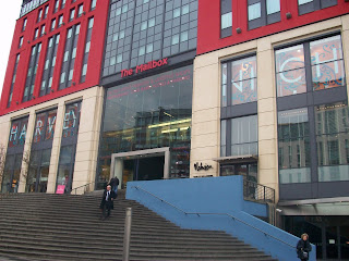
 I only realised this chain of stores existed when I came to uni in Nottingham and ever since have become quite a fan. There is a nice mix of clothes and feature some key players within the urban 'progressive streetwear' realm. The Birmingham store sits within the ground floor of the Pavillion which is more well-known for its Disney store and places to eat rather than decent shops... perhaps this reflects Aspecto's brand image of being slightly off-centred and out of the blue!?
I like the way that Barbour is stocked and arranged so tightly amongst streetwear brands such as Money and Stussy and Clarks (classics!) footwear is on show next to Adidas Y-3's, to me this store portrays today's streetwear/urban inspired consumer in the way that there is an unforgiving attitude to collaborating old with new and taking inspiration from past trends and key styles, mixing them up and spitting them out as something fresh and unique. I feel from looking at the type of consumer I see myself aspiring to or within the urban cult there is a stronger sense of individuality and spotaniety in the way in which people dress/express themselves using clothing. There is a clear move away from the stereotypical XXL, big-brand-bling vulagrity and 'cheese' of the 90s (thank god) which can definately be seen within the music. Artists such as 50 Cent, The Game and the whole commercial club-style hip hop icons have slowly deminished and now we are left with the uprise of (what was) the underground of back-pack rap & elctro-hop with artists such as Kid Cudi, J Cole, Drake, Theophilus London and the super-individual characters such as Will.I.am and Kanye West which now inspire the fashion industry more so than ever! It is now cool to be seen in Oxfam or 'vintage shops' or to borrow your Dad's loafers and deck shoes.
 A result of styling becoming much more eclectic with a more open sense to what is deemed fashionable/accepted (which is now pretty much anything)... even Jay-Z came out of semi-retirement to rebrand himself from his old image into a more fashion savvy, upmarket, modest fashionista wearing "ALL BLACK EVERYTHING" This shift has seen a gap in the market for stores such as Aspecto and Size? and local inde's to move into, stocking an eclectic mix of classic and fresh streetwear brands.
That was then...

This is NOW...
 "Oversize clothes and the chains... we off that" <<(Listen.)

 Since the phenomenom of 'technology' and web 2.0 of the last 10 years I think brands have lost track of their brand essence and how to promote this to the consumer. Understandably the rise of such digital communications such as social networking, blogging, video share, chat rooms etc. have been intriguing for brands to play with but perhaps for some brands their heritage and roots don't fit with this 'techno' age, and neither do their consumers. Consumers also are much more clued up on such digital communications now (more so than many brands!) so they can also be more conversational and interactive with what works and what's right. They can let you know if a brand has done something wrong or designed a collection that they don't like and have the power to let everybody know too!
 The increase and development of online shopping now also makes the retail store more important to sell the heritage of the brand and the identity/experience in bricks and mortar and to look more local. A really nice example of increasing 'localability' through a brand has been shown by Size? who's new stores look to reflect the history and roots of the city. e.g. the new Southampton store has been given a nautical theme reflecting its coastal roots for recieving shipments from all over the world. Also the Bristol store, which opened back in 2009 kept it local with an oversized horse on the front of the shop, paying homage to the Horsefair in Bristol, where the store is located. (I will go into this local theme in another post!)

 This can't be good for Alife's brand image within the UK market which it is fairly unkown to, in comparison to the synonymous repect with the brand name in the US. Pricing (supposedly) high end, market leading brands at the same price as Primark can be detrimental to the brand and its price&quality reputation since we tend to always see high price as high quality as consumers. £20 for a pair of Alife trainers isn't speaking true to the brand image or helping it gain the same type of respect that it has across the Atlantic in the US market. I feel that there is real potential for this brand to grow in the UK especially with the growth in retro, ultra-individual, ghetto-chic trends we are currently seeing at the moment especially in streetwear.


 The 'new normal' of retail stores looking to try and sell more of an experience and identity was also evident with the use of catwalk videos being played on wall-mounted monitors. This makes the whole environment feel more personal by increasing the amount of interaction/communication from the store to consumer and is more sophisticated than a standard poster. The Birmingham store was also advertising their exclusive Fashion Show on posters and flyers in-store. The show is on Tuesday 2nd March 2010, from 6.30pm and will begin with a champagne reception followed by a runway featuring the key looks from menswear and womenswear Spring/Summer 2010 collections... Nice little bit of PR and marketing for their SS10 collections.


 *statistically - you are 99% less likely to get rammed by a buggy or trod on accidently by somoeone you swear you recognise off Jeremy Kyle.


 The feel to this campaign is rebellious, youthful and creative, very much the brand identity of Diesel's adolescent son - FiftyFive DSL (55DSL) who I am also a fan of. This spring, the two brands are sharing a very similar attitude... like father like son! 55DSL has always been a favourite of mine but I feel the brand could be/should be much bigger than it actually is within the UK. With more direct marketing to the consumer and some effective PR (sponsoring a few urban music gigs, skateboard comps, graffiti workshops, graphics/illustration comps - that kinda thing) the 55DSL brand would begin to share the same respect as its better established co-brand. The way the 2 brands are currently marketing themselves however is refreshing to see as many of their competitors are currently playing it safe. LONG LIVE STUPID.